
Innovative Approaches to Designing Custom Banners That Capture Attention
Innovative Approaches to Designing Custom Banners That Capture Attention
Forget the old rule that loud colours and big fonts guarantee attention. Your custom banners need more than just size—they require smart banner design that draws eyes and holds interest. In this post, you’ll find creative methods to craft banners with real visual impact, backed by KS Print Ltd’s high-quality printing expertise. Ready to make your event promotion stand out? Let’s explore what works best. For more insights, check out this guide on designing attention-grabbing banners.
Crafting Visual Impact
Creating a custom banner that stands out involves more than just choosing colours and fonts. Let’s dive into how you can make your banners truly impactful.
Choosing the Right Colours
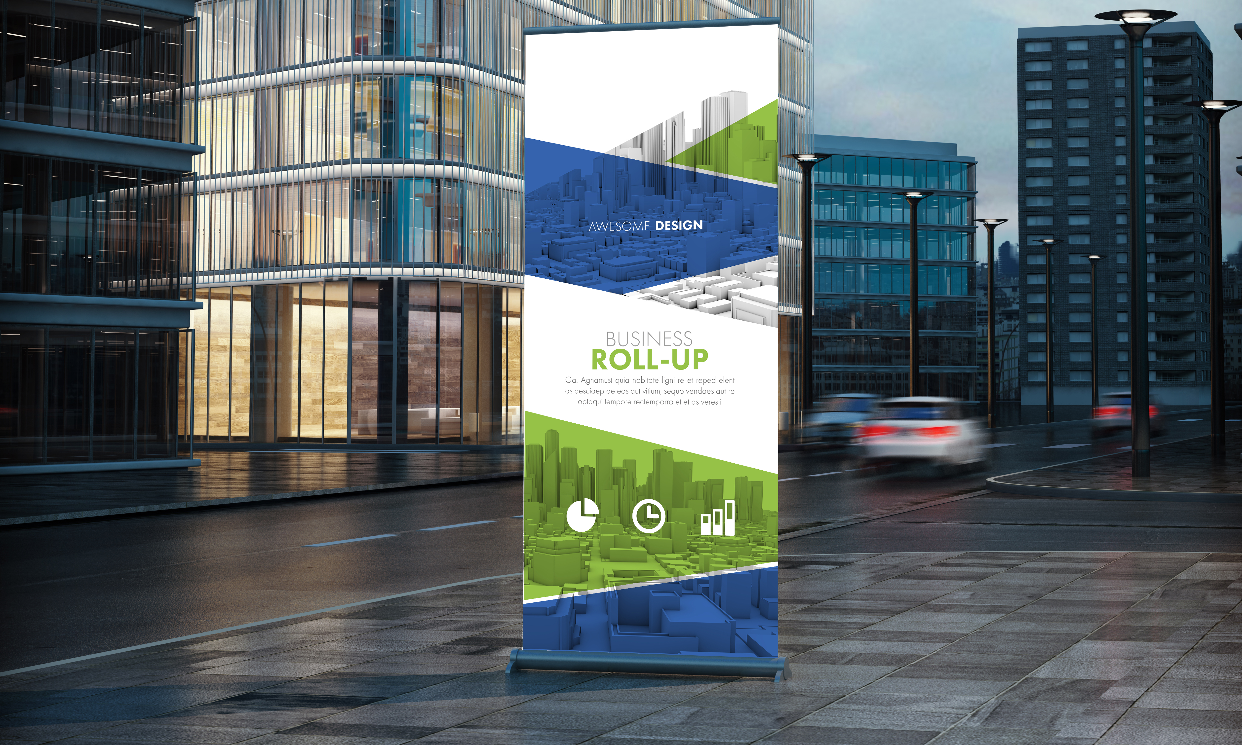
Colours play a crucial role in catching the eye. They can evoke emotions and set the tone for your message. Picking the right colour scheme is essential for capturing attention. Bright colours like reds and yellows can create a sense of urgency, while blues and greens often convey calmness and trust.
Consider the branding of your business. Consistency in colour usage across your marketing materials reinforces your brand image. If your brand’s primary colour is blue, using it in your banners helps with recognition. Remember, too many colours can be overwhelming. Stick to two or three shades to keep it clean and professional. For more ideas, explore creative ideas for custom banners.
Eye-Catching Typography Choices
The font you choose can make or break your banner’s effectiveness. It needs to be legible from a distance. Sans serif fonts like Arial or Helvetica are often recommended for their readability. Your main message should be in a larger font size to ensure it’s the first thing people see.
Experiment with bold styles for key points, but maintain consistency. Avoid using more than two different fonts to keep your design coherent. A study showed that 72% of people find banners with clear fonts more engaging. Keep this in mind when designing your banner. If you want additional guidance, check out these design tips.
Techniques for Effective Banner Design
With your colours and fonts set, it’s time to explore techniques that enhance your banner’s overall look.
Utilising Negative Space
Negative space, or the empty areas around your design elements, can be powerful. It prevents your banner from looking cluttered and helps your message stand out. By strategically placing your text and images, you guide the viewer’s eye to what matters most.
Think of negative space as a tool to highlight important information. A crowded banner can be off-putting, whereas one with ample space feels balanced and inviting. Most people think filling every inch is effective, but leaving space can actually draw more attention to your message. Open space can make your banner 42% more appealing to viewers.
Incorporating High-Quality Images
Images can greatly enhance your banner, but quality is key. Blurry or pixelated pictures can damage your credibility. Always opt for high-resolution images that are relevant to your message. For instance, if you’re promoting a summer sale, a bright, crisp image of a sunny beach scene can be very effective.
The right image can convey a message faster than text. Ensure it aligns with your brand and complements your colour scheme. Remember, a picture is worth a thousand words. Using high-quality images ensures your banner communicates effectively and leaves a lasting impression. Explore more about the importance of imagery here.
Promoting Your Event with Banners
Now that your banner looks great, it’s time to think about how to use it to its full potential in promoting your event.
Placement Strategies for Maximum Exposure
Where you place your banner can significantly impact its effectiveness. High-traffic areas are ideal, such as entrances or near popular attractions. If your event is outdoors, consider windy conditions and ensure your banner is secured.
Height is another factor. Banners should be at eye-level to avoid being missed. If possible, test different locations and observe which spots get the most views. Knowing where to place your banner can increase visibility by 50%, making it a crucial step in your event promotion strategy.
Tailoring Designs for Specific Audiences
A one-size-fits-all approach rarely works. Tailoring your banner to fit the audience’s needs can create a stronger connection. Are you targeting families? Consider including cheerful imagery and text that speaks to that demographic. For a corporate audience, a sleek and professional design may be more appropriate.
Understanding your audience allows you to design a banner that resonates with them. Take into account the event’s theme and the attendees’ interests. This attention to detail can make your banner much more effective in drawing interest and engagement.
🌟🎨📈

