

How to Prepare Artwork for Print: A No‑Fuss Guide to First‑Time Approval
Sending artwork to print without a hitch starts with getting your files right the first time. Too often, overlooked details like colour modes or missing bleed cause delays that eat into your schedule. This guide shows you how to prepare artwork for print so your files pass preflight checks smoothly, saving time and stress. Follow these steps, and you’ll get crisp, vibrant prints ready for production with KS Print Ltd’s expert support.
Essentials of Print-Ready Artwork
Getting your artwork print-ready ensures smooth production and stunning results. Here’s what you need to know to avoid common pitfalls and set your projects up for success.
Understanding CMYK vs RGB
To start, always use CMYK for print projects. This colour model is essential for achieving accurate colours on paper. Unlike RGB, which is used for screens, CMYK translates better into physical mediums. So, when designing for print, ensure your software is set to CMYK to avoid unexpected colour shifts. This simple step can save you from costly reprints and unhappy clients.
Importance of Bleed and Crop Marks
Bleed and crop marks are crucial in the print process. Bleed refers to the extra space around your artwork, ensuring no white edges appear after trimming. Typically, a 3mm bleed is recommended in the UK. Crop marks indicate where the paper should be cut. When setting up your document, add bleed and crop marks to maintain the integrity of your design. This attention to detail ensures a polished final product.
Safe Area and Trim Guidelines
Every printed piece has a safe area, ensuring important elements aren’t cut off. Keep all text and key visuals within this zone to guarantee they remain visible after trimming. The trim line is where the paper is actually cut, and it’s vital to respect this boundary. By adhering to these guidelines, you maintain the design’s balance and clarity.
Preparing Files for Preflight Checks
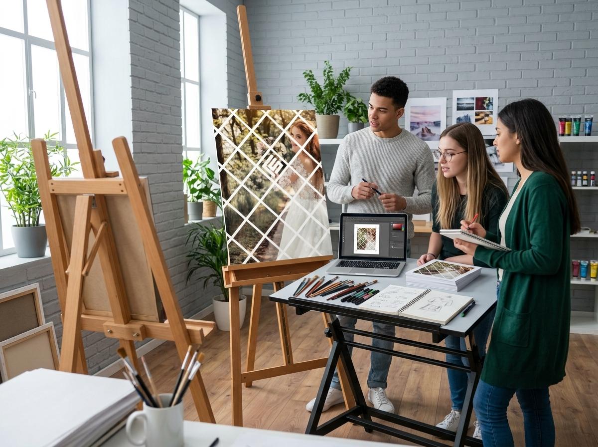
Once your artwork is designed, it’s time to prepare it for preflight checks. This step is crucial for catching any errors before production begins.
Outline Fonts and Embed Images
Fonts can cause issues if not handled correctly. Convert your text to outlines to preserve the design, preventing font substitutions during printing. Embedding images ensures they remain linked to your file, maintaining quality and resolution. By outlining fonts and embedding images, you eliminate common technical glitches that can delay your project.
Vector Logos and Rich Black CMYK
Logos should always be in vector format. This ensures they print crisply at any size, maintaining their quality. For rich black areas, use a mix of CMYK to get a deep, professional look. These steps ensure your branding elements stand out with clarity and impact.
Choosing Pantone Spot Colours
Pantone colours provide consistency across different prints. If your project demands exact colour matching, use Pantone spot colours. These are perfect for brand-critical designs, ensuring your corporate colours are consistent and true to your brand’s identity.
Specific Artwork Specifications
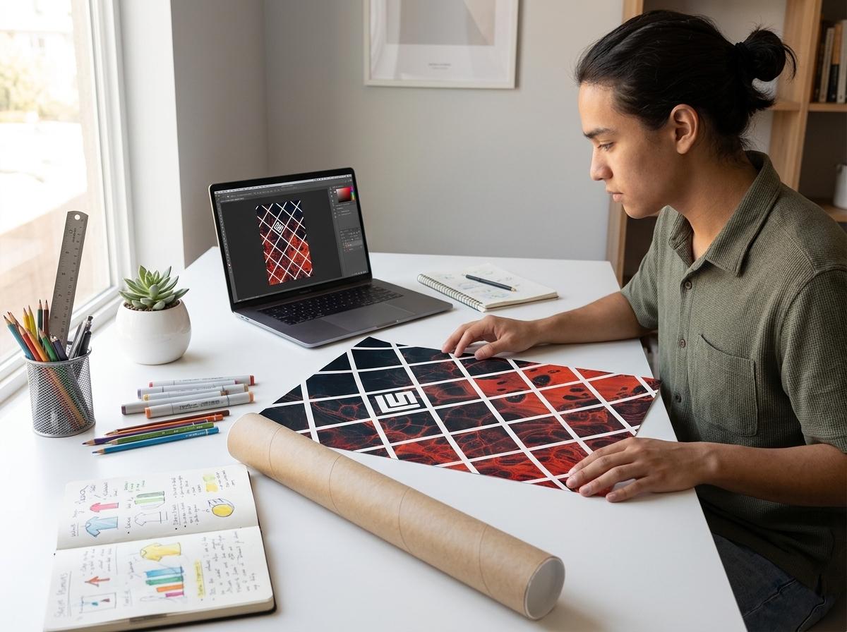
Different products require specific considerations. Here’s how to tailor your artwork for various types of print.
Roller and Scaffold Banner Artwork
Roller and scaffold banners demand attention-grabbing designs. Use bold, high-contrast images and large text to maximise visibility. Ensure all elements are within the safe area to avoid data loss during trimming. This approach guarantees your banners will stand out in any setting.
Folded Leaflet Templates and Poster Printing
Folded leaflets and posters need careful layout planning. For leaflets, ensure each panel is clearly defined with no text crossing folds. Posters should be designed at a high resolution, typically 300dpi, to ensure clarity when printed at larger sizes. Attention to these details elevates the quality of your materials.
Custom Packaging Dielines and Stationery Printing
Custom packaging and stationery require precision. Use the dieline provided by your printer to ensure measurements are accurate. For stationery, maintain a clean and professional design that reflects your brand. Following these steps ensures your products are both functional and visually appealing.
Frequently Asked Questions
1. Why is CMYK preferred over RGB for printing?
CMYK is ideal for printing because it matches the inks used in commercial printers, ensuring accurate colour reproduction in print.
2. How much bleed is typically required for print in the UK?
A standard 3mm bleed is typically used in the UK to prevent white edges after trimming, ensuring a clean, professional finish.
3. What is the purpose of outlining fonts in print design?
Outlining fonts ensures they are displayed correctly in print, preventing substitution issues that can occur if the printer doesn’t have the font.
4. How do Pantone spot colours benefit print projects?
Pantone spot colours ensure consistent colour matching across different print jobs, maintaining brand integrity and precise colour reproduction.
5. What are the key considerations for designing roller banners?
Ensure high contrast and visibility with large text and bold images, keeping all elements within the safe area to maximise impact and avoid trimming issues.
By following these best practices, you can confidently prepare your artwork for print, knowing it meets professional standards. This knowledge not only reduces stress but also enhances the quality of your final product, making a lasting impression with every piece.

