

Print-ready artwork: a step-by-step guide to start smoothly and stay on schedule
Preparing artwork for print can feel like navigating a maze of technical details and tight deadlines. Getting your files right from the start means your order with KS Print Ltd moves forward without hold-ups or costly reworks. In this guide, you’ll learn exactly how to prepare artwork for print, covering bleed, safe areas, colour modes, and more, so your project stays on schedule and looks flawless. Download our free templates and get expert tips to set your print job up for success. For further guidance, you might find this guide helpful.
Getting Print-Ready Artwork Right
To ensure your printing project hits the mark, understanding the basics of preparing your artwork is crucial. Let’s dive into the essential elements that make your print job seamless and stress-free.
Understanding Bleed and Safe Areas
Bleed is crucial for any printed piece to avoid unwanted white borders. It refers to the extra space around your artwork that gets trimmed away. Typically, adding 3mm of bleed ensures your design extends to the edge of the page. Safe areas are equally important. These are zones where critical elements like text should be placed to prevent them from being cut off. Aim to keep text and key graphics at least 5mm from the trim edge to ensure they remain intact.
Ignoring bleed and safe areas can lead to frustrating results, so take the time to adjust your artwork accordingly. It’s a simple step that can prevent costly reprints. For more on this, check out this helpful guide.
CMYK vs RGB for Print
When preparing artwork, the choice between CMYK and RGB colour modes is pivotal. CMYK (Cyan, Magenta, Yellow, Black) is the standard for print because it’s designed to match the inks used in printers. On the other hand, RGB (Red, Green, Blue) is used for digital screens. If you submit artwork in RGB, your colours might not print as expected.
Converting to CMYK ensures colours stay true to your design. Use design software like Adobe Illustrator or Photoshop to switch modes seamlessly. This simple change can make a big difference in your final print quality. For more insights on colour modes, explore this information source.
Resolution and Image Quality
For crisp, clean prints, resolution matters. The standard resolution for print-ready artwork is 300 dpi (dots per inch). This ensures images are sharp and detailed. Lower resolutions might look fine on screen but can appear blurry or pixelated in print.
Always check your image quality before submitting your artwork. If you’re resizing images, do so cautiously to maintain clarity. Remember, a higher resolution often means larger file sizes, so balance this with your needs for quality and manageability. Learn more about setting the right resolution here.
Essential Elements for Professional Print
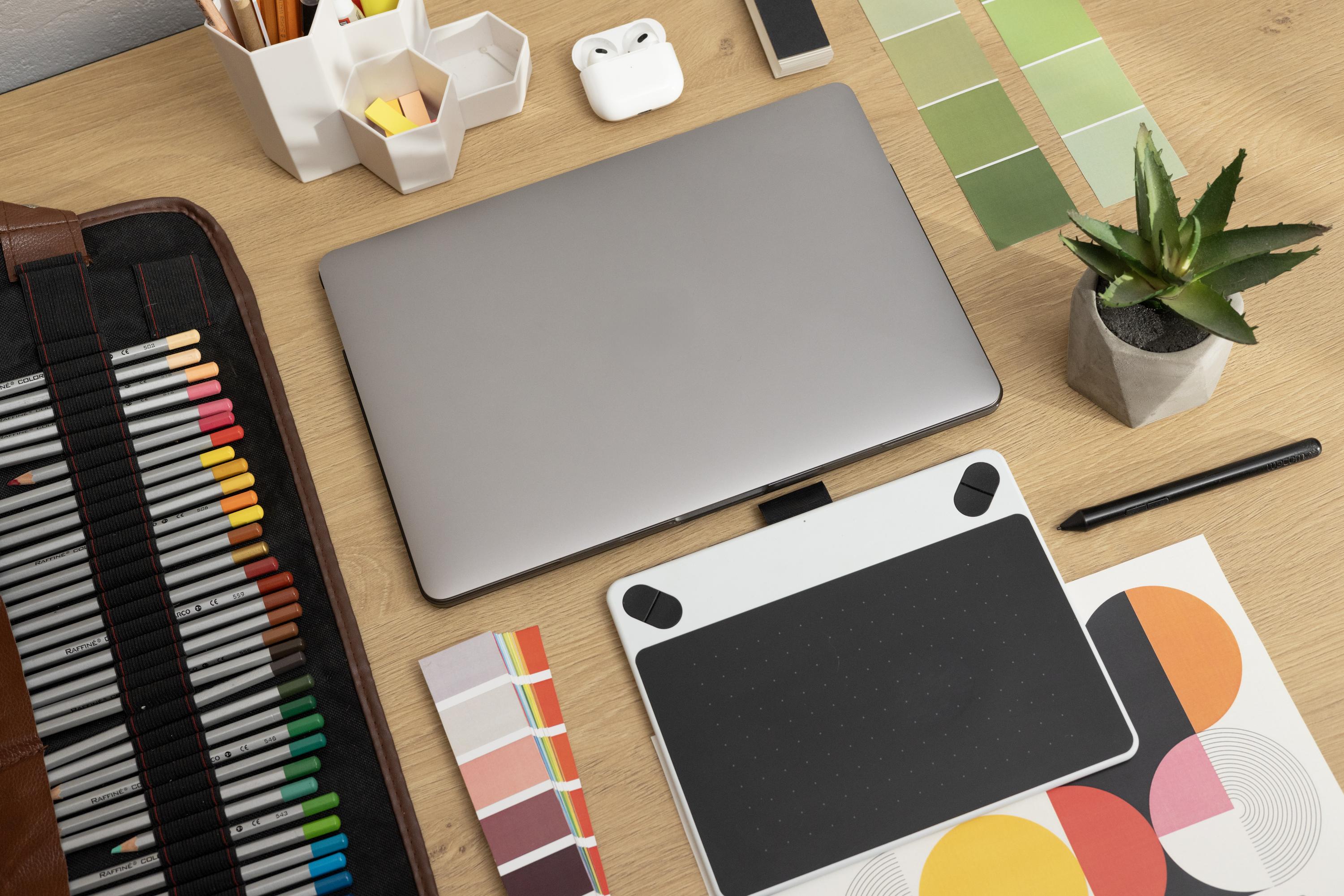
With the basics covered, it’s time to look at finer details that elevate your print work to a professional level.
Outline Fonts and Embed Images
To prevent font issues during printing, convert your text to outlines. This process turns text into vector graphics, ensuring no unexpected font substitutions occur. Similarly, embedding images directly into your file helps maintain quality without unexpected changes.
These steps ensure your design appears as intended without adjustments or errors during printing. It’s a small effort that provides peace of mind and preserves your artistic vision.
Choosing the Right File Format
Selecting the right file format is key. PDF/X‑1a and PDF/X‑4 are preferred for professional printing due to their ability to handle complex artwork with transparency and layers. These formats lock in your design elements and minimise the risk of alterations.
Choosing the right format means your print provider receives exactly what you envision. For a deeper understanding of file formats, you can refer to this detailed guide.
The Importance of Colour Proofing
Colour proofing is essential to verify the colours in your design before they go to print. A hard proof, or a printed sample, shows exactly how your final print will look. Alternatively, soft proofing on calibrated monitors can also be effective.
Colour proofing helps catch discrepancies early, allowing for adjustments before mass production. It ensures the colours you see on your screen match the final print, reducing the risk of miscommunication and costly errors.
Perfecting Your Print Setup
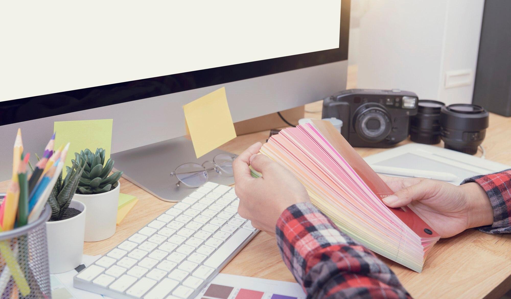
You’ve got the essentials down, but a perfect print setup requires a few more steps for a flawless finish.
Utilising Templates for Setup Ease
Templates are your best friend when setting up artwork. They provide guidelines for bleeds, trims, and safe areas. Use templates for common items like roller banners and scaffold banners to streamline your process. They save time and reduce errors.
By using templates, you ensure your artwork aligns perfectly with the final product dimensions, making your job easier and your print accurate.
Conducting a Pre-Flight Check in the UK
A pre-flight check is a final review of your artwork before sending it to print. This includes checking for font issues, image resolution, and colour modes. It’s an essential step to catch any last-minute issues.
In the UK, conducting a pre-flight check aligns with industry standards, ensuring your print meets expectations and avoids delays. Consider it your final safety net before hitting “print.”
Ensuring Express Delivery with KS Print Ltd
When your artwork is prepared correctly, express delivery becomes a breeze. KS Print Ltd offers reliable and swift delivery services that keep your timelines intact. With everything set up right, your project moves smoothly from screen to physical print.
The longer you wait to get started, the more you risk project delays. Ensure your setup is perfect, so your prints are ready on time and in top quality.
Frequently Asked Questions
What is bleed, and why is it important in printing?
Bleed is the area beyond the trim line of your print where your design should extend. It’s crucial to prevent unwanted white borders from appearing once the print is cut to size. Including bleed ensures your design covers the whole sheet edge-to-edge.
Should I use CMYK or RGB for print?
For print, always use CMYK. This colour mode matches the inks used in printing, ensuring your colours are accurate when transferred from digital to print. RGB is suitable for screens, not for printed materials.
What resolution is best for print-ready artwork?
The best resolution for print is 300 dpi. This ensures your images are sharp and clear in the final print. Lower resolutions might appear pixelated or blurry when printed.
How can I ensure my fonts print correctly?
Convert your text to outlines before submitting your artwork. This step turns text into a vector graphic, preventing font substitutions during the printing process.
What file format is best for professional printing?
PDF/X‑1a and PDF/X‑4 are ideal for professional printing. They preserve your design elements and handle complex artwork effectively, ensuring what you send is what gets printed.

