
What Makes Artwork Print‑Ready for Professional Printing? Your Essential Checklist
Many print projects stall because the artwork isn’t ready for professional printing UK standards. You might have a great design, but missing key details like bleed and safe area or using RGB colours can cause delays and extra costs. This checklist will guide you through what makes print-ready artwork tick, so your files run smoothly from upload to print. For more details, check out this guide to preparing print-ready artwork.
Understanding Print-Ready Artwork
Creating print-ready artwork ensures your designs move smoothly to production without unnecessary delays or expenses. Let’s dive into the essentials that make your files truly ready for professional printing.
Importance of Bleed and Safe Area
The bleed and safe area are crucial for avoiding unexpected cuts on your artwork. Bleed allows extra space for designs to extend beyond the trim, which helps prevent white edges after trimming. A common practice is to add 3-5mm of bleed. The safe area is where you keep important elements like text and logos, away from the edges to avoid accidental cropping. This ensures nothing vital gets chopped off. Remember, giving your artwork that extra room helps maintain its integrity during the final cut.
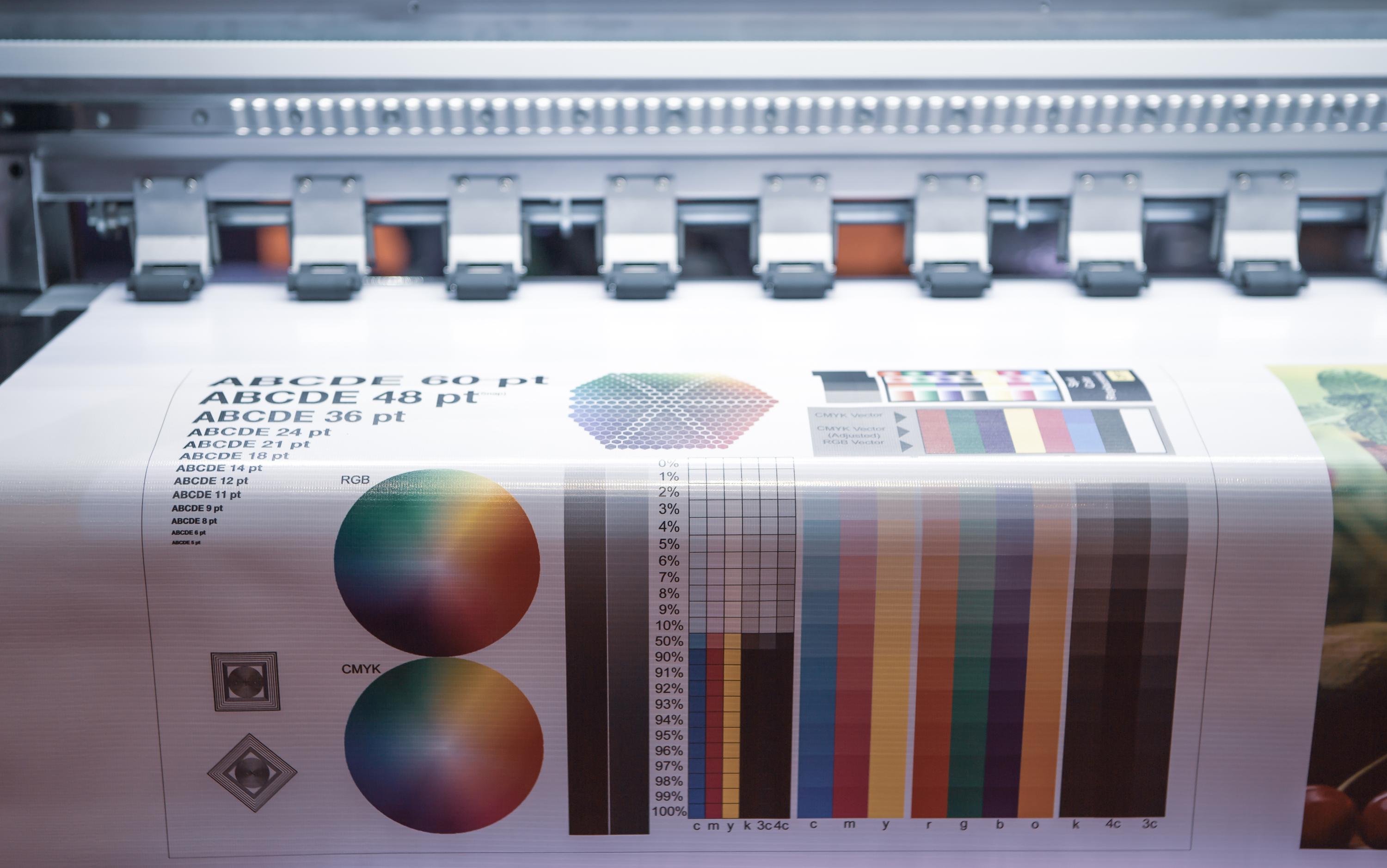
CMYK Not RGB: Getting Colours Right
Using the right colour mode is essential. While RGB is perfect for screens, CMYK is crucial for printing. This mode uses four colours—cyan, magenta, yellow, and key (black)—to create a full spectrum. Converting your files to CMYK helps maintain colour consistency in print. It’s wise to start your design in CMYK mode. This way, your vibrant greens and blues won’t look muted when printed. Always double-check your colours before sending files to print.
300 DPI Resolution: Ensuring Clarity
Resolution plays a vital role in how your final artwork appears. The golden rule is to use a resolution of 300 DPI (dots per inch). This ensures your design is sharp, with crisp lines and clear details. A lower DPI could turn your beautiful design into a blurry mess. Always check your images and graphics are set to 300 DPI. This small step makes a big difference in achieving a professional-quality print.
Essential File Preparation Techniques
Getting your artwork print-ready requires more than just a great design. Here are the techniques to ensure your files meet professional standards.
Vector Logos vs Raster: When to Use Each
Understanding the difference between vector and raster graphics is key. Vectors are perfect for logos and graphics that need resizing without losing quality. They use mathematical equations to define shapes, keeping them crisp at any size. On the other hand, raster images, made of pixels, can become pixelated when enlarged. Use vectors for logos and illustrations, and reserve raster images for photos. This approach ensures the best quality for each element in your artwork.
Outline Fonts: Convert to Curves
Font issues can easily derail a print project. Converting fonts to outlines, or curves, helps avoid missing font problems. It turns text into a graphic element, locking in your chosen style. This step ensures your text appears exactly as intended, regardless of the printer’s font library. Before finalising your artwork, take the time to outline all text. It’s a small step that guarantees your message remains clear and legible.
Choosing Correct File Formats
Choosing the correct file format is crucial for hassle-free printing. PDFs, especially PDF/X‑1a and PDF/X‑4, are preferred for their compatibility and ability to embed fonts and images. They keep your artwork intact, with all details preserved. Other formats like JPEGs or PNGs may lose quality or have missing elements. Always save your artwork in a print-ready PDF. This ensures your design retains its quality and integrity from screen to print.
Optimising for Professional Printing UK
To achieve the best results, you must optimise your files for professional printing standards. Here’s what to focus on for seamless production.
Trim Size and Crop Marks
Knowing your trim size is essential. It dictates the size of the final printed piece. Adding crop marks to your design shows where to cut the paper, ensuring the print aligns perfectly with your intended size. These marks are vital for guiding the printer during trimming. Always include crop marks in your artwork to maintain control over the final appearance of your printed materials. This small addition can make a big difference in the quality of your print job.
Rich Black Values and Spot Colours
Achieving deep, rich blacks in print requires more than just 100% black. By using a mix, such as C: 60, M: 40, Y: 40, K: 100, you get a more vibrant black. Spot colours and Pantone can also enhance your design, adding consistency and precision in branding. These special inks ensure exact colour matches. Incorporate rich black values and spot colours to elevate your print’s appearance, keeping your brand image sharp and consistent.
Managing Transparency and Overprint
Handling transparency and overprint correctly avoids unexpected print results. Transparency can cause issues, such as hidden elements appearing unexpectedly. Flatten transparencies to prevent this. Overprint settings ensure overlapping colours blend correctly, preventing white gaps. Adjust these settings to maintain design integrity. By managing transparency and overprint effectively, your artwork will print just as you envisioned, with no surprises.
This checklist empowers you to create print-ready artwork with confidence. Avoid costly mistakes and delays by following these guidelines. Remember, well-prepared files save time and money. The longer you wait to implement these strategies, the more you risk errors. Get started today with these essential tips for professional printing success.

