

What Makes Outdoor Signage Easier to Read in Busy Environments
Most outdoor signs vanish into the background when placed in busy spaces. Your message deserves to stand out, not get lost in the clutter. This post breaks down how smart design choices, materials, and positioning boost outdoor signage readability so your brand cuts through the noise with ease. Read on to find out how KS Print Ltd crafts legible outdoor signs that do exactly that. For more insights, take a look at this link.
Designing Legible Outdoor Signs
Creating outdoor signs that grab attention is both an art and a science. It’s crucial to focus on how the design elements enhance readability.
Font and Layout Choices
The right font and layout make all the difference. Choose fonts that are clear and simple. Avoid overly decorative styles that can be hard to read from a distance. Instead, go for bold, sans-serif fonts. They stand out better and deliver your message quickly.
Layout also plays a vital role. Keep it clean and uncluttered. Too much information can confuse the viewer. Use bullet points or list formats to break down the content. Remember, the space around the text is just as important as the text itself. It helps guide the viewer’s eye, making your message clear and easy to digest.
High-Contrast Colour Schemes
Colours can either make your sign pop or blend into the background. High-contrast colour schemes ensure your sign stands out. Think black text on a yellow background or white text on a dark blue background. These combinations are easy to read from afar.
Your brand colours can be a great starting point. Just ensure there’s enough contrast to make the text legible. It’s not just about aesthetics; it’s about making sure your message is seen and read. For more tips, check out this guide.
Appropriate Letter Heights
Size matters when it comes to letter heights on signage. The rule of thumb is one inch of letter height for every ten feet of viewing distance. So if you want your sign to be read from 100 feet away, your letters should be at least 10 inches tall.
This guideline ensures that your message is readable even from a distance. It’s a simple adjustment that can significantly impact how effectively your sign communicates.
Materials for Weatherproof Signage

Choosing the right materials is essential for outdoor signs that last. Weather conditions can be harsh, and your signage needs to endure them.
Durable and Resistant Materials
For outdoor signs, durability is key. Materials like aluminium, acrylic, and PVC are excellent for withstanding the elements. They resist rust, fading, and weather damage, ensuring your sign remains vibrant over time.
Investing in quality materials means less frequent replacements, which saves you money in the long run. Plus, durable signs maintain their professional appearance, keeping your brand’s image intact.
Anti-Glare Finishes
Glare can make even the best-designed sign unreadable. Anti-glare finishes help solve this problem. These coatings reduce the reflection of sunlight, making your sign visible from various angles and in different lighting conditions.
Whether it’s a bright sunny day or cloudy, your sign should be easy to read. This feature is particularly useful in high-traffic areas, where quick readability is crucial. For more information on enhancing visibility, explore this resource.
Strategic Placement for Visibility
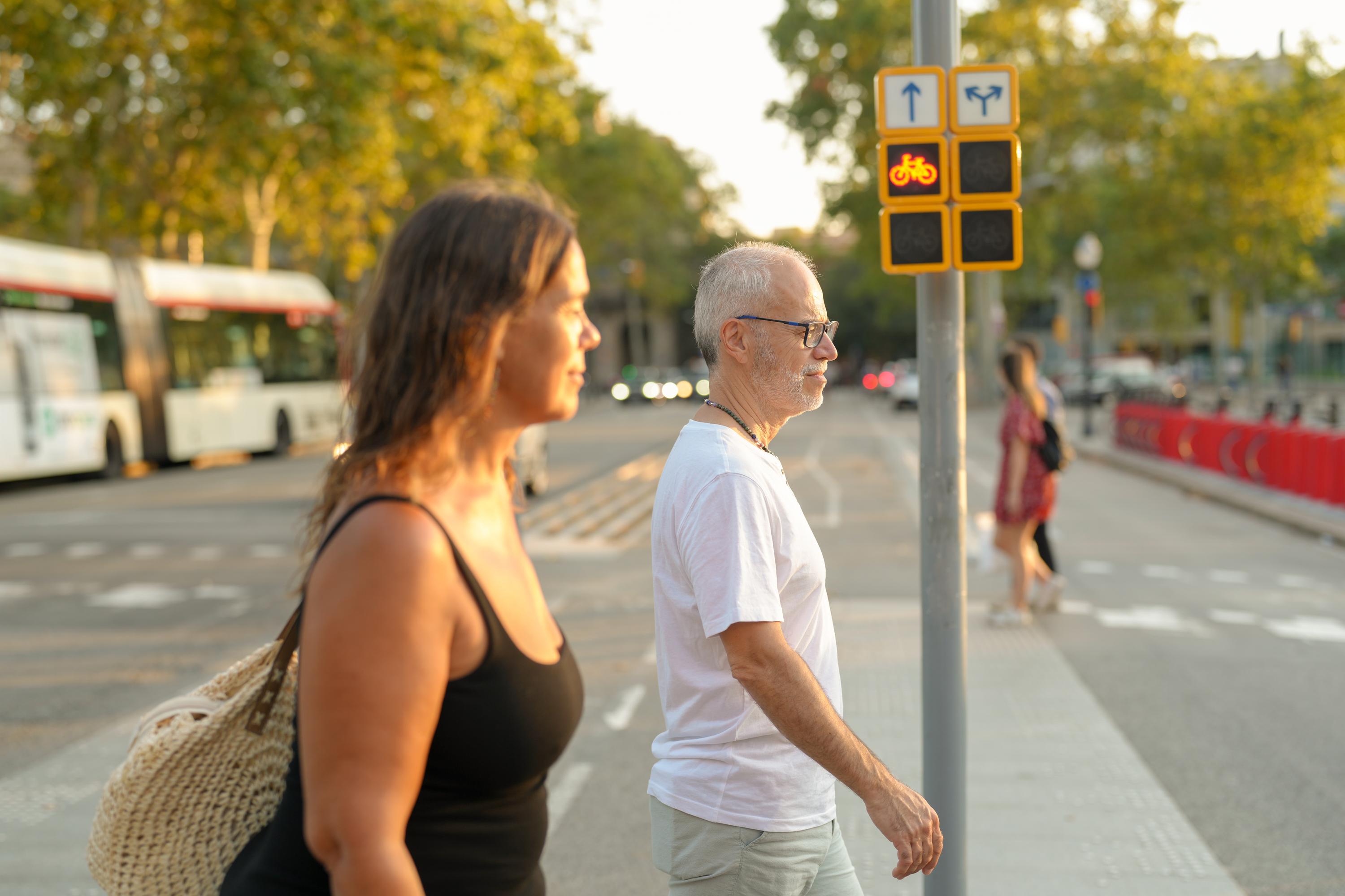
The placement of your sign can greatly impact its effectiveness. It’s not just where you put it, but how you position it.
Effective Positioning in Busy Areas
In busy areas, strategic positioning is crucial. Place your sign at eye level where it’s most likely to grab attention. High visibility spots like intersections, entrances, or near complementary businesses work well.
Consider pedestrian and vehicular traffic flow. Your sign should be easily seen without obstructions. This strategic placement ensures your message is delivered to the right audience at the right time. For more on strategic placement, see this article.
Secure Fixings and Reinforced Hems
Stability is essential for outdoor signs. Secure fixings and reinforced hems protect your sign from wind and other weather conditions. They ensure your sign stays put and maintains its position.
Using quality fixings prevents damage and the need for frequent repairs. It also gives you peace of mind knowing your sign won’t become a hazard in bad weather. For further insights into outdoor sign stability, visit this link.
Frequently Asked Questions
What is the best font for outdoor signage?
Simple, bold, sans-serif fonts are best for outdoor signs. They are easy to read from a distance and stand out in busy environments.
How do I choose the right colour scheme for my sign?
Opt for high-contrast colours like black and yellow or white and blue. These combinations make your sign more readable and eye-catching.
What materials are best for weatherproof signage?
Aluminium, acrylic, and PVC are excellent choices. They resist weather damage and maintain their appearance over time.
How high should letters be on a sign?
A good rule is one inch of letter height for every ten feet of viewing distance. This ensures readability from afar.
Why use anti-glare finishes on signs?
Anti-glare finishes reduce reflections, making signs readable in various lighting conditions and from different angles.

