

Clear signage in crowded spaces: a practical guide to staying readable, indoors and out
Clear signage often gets lost in busy spaces, costing you attention and impact. When your signs blend into the background, your message fails before it even reaches your audience. This guide shares proven tips on readable signage that works indoors and outdoors, helping you choose materials and designs that stand out. With KS Print Ltd’s expertise, your signs won’t just be seen—they’ll be remembered.
Choosing the Right Signage Materials
Selecting the right materials is crucial to ensure your signage stands out and endures in various environments. Let’s explore options that suit both outdoor and indoor needs while maintaining legibility.
Durable Options for Outdoor Use
Outdoor signs face harsh elements, so durability is key. Dibond signs are a popular choice due to their strong aluminium composite material that resists rust and corrosion. They offer a lifespan of 5 to 10 years, even in tough weather conditions. Correx boards, made from fluted polypropylene, are lightweight yet sturdy, perfect for temporary outdoor events or construction sites. They are cost-effective and easy to install, making them ideal for short-term use. Another option is mesh banners, which allow wind to pass through, reducing strain and the risk of damage. These are excellent for large-scale advertising, especially in windy areas. For maximum effect, opt for UV-resistant inks to keep colours vibrant under the sun.
Ideal Indoor Signage Solutions
Indoor signs need to be visually appealing and versatile. Foamex boards offer a smooth surface for high-quality printing, making them perfect for retail displays and exhibitions. They are lightweight and easy to mount, providing flexibility in placement. Roller banners are another great choice for indoor use. They are portable and set up quickly, making them ideal for conferences and trade shows. With options to customise graphics, they can effectively communicate your brand message. For permanent installations, consider acrylic signs. They offer a sleek and modern look, suitable for office environments. Acrylic can be printed with detailed designs, enhancing professional settings.
The Importance of Weatherproof Signage
Weatherproof signs are essential for outdoor durability. Materials like Dibond and Correx offer resilience against rain, sun, and wind. When selecting outdoor signage, look for options coated with anti-UV laminations to prevent fading. Weatherproof signage extends the life of your message, ensuring it remains impactful despite the elements. This is especially important for businesses operating year-round. Investing in quality materials means fewer replacements, saving costs in the long term. Using weather-resistant graphics ensures your brand message stays clear and vibrant, reinforcing your presence in the market.
Designing for Maximum Readability
Once you have the right materials, focus on design elements that enhance readability. Here’s how to make your signs easy to read from any distance.
High-Contrast and Reflective Choices
High-contrast designs catch the eye and improve legibility. Use dark text on a light background or vice versa. Reflective vinyl is an excellent way to make signs visible at night or in low-light conditions. It’s particularly useful for safety and directional signs. Incorporating reflective elements can double the visibility of your signage in dim settings. This is critical for ensuring your message is seen at all times, especially in high-traffic areas.
Best Practices for Letter Height and Fonts
Choosing the right font and size is vital. Start by considering the viewing distance. For every metre, letters should be at least 2.5 cm tall. Sans-serif fonts like Arial or Helvetica are recommended for their clarity and ease of reading. Avoid overly decorative fonts; they can reduce legibility. Keep text simple and concise. Use bullet points or short sentences to convey information effectively. This approach ensures your audience grasps your message quickly, without confusion.
Benefits of Anti-Glare Laminations
Anti-glare laminations enhance readability by reducing reflections. This feature is particularly beneficial for digital displays or signs exposed to direct sunlight. By minimising glare, your sign remains clear from various angles and lighting conditions. It’s a simple addition with significant impact, ensuring your message stays visible and professional. Investing in anti-glare options boosts the overall quality and effectiveness of your signage, especially in challenging lighting environments.
Enhancing Visibility in Crowded Spaces
In busy environments, your signage needs to cut through the noise. Here’s how to make sure your message gets noticed, no matter the crowd.
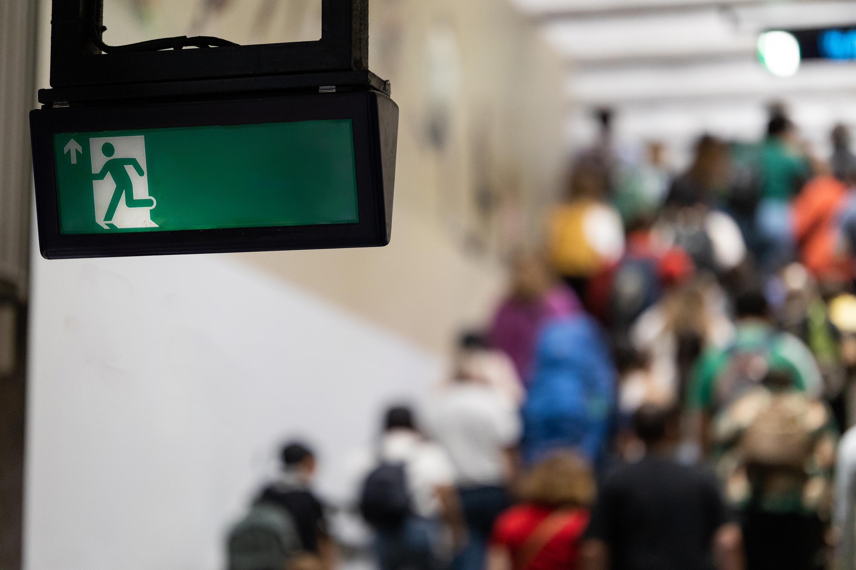
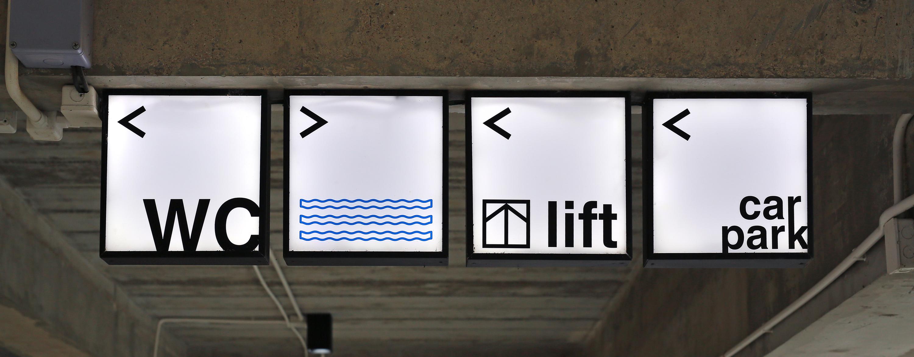
Effective Use of Wayfinding Signs
Wayfinding signs guide people through spaces efficiently. They should be clear, concise, and strategically placed to prevent confusion. Use arrows and universal symbols to aid understanding. These signs are crucial in large venues like malls or airports, where people rely on them for navigation. Ensuring your wayfinding signs are visible and intuitive can enhance visitor experience and reduce frustration, leading to a more organised flow.
Role of Colour Management in Clarity
Colour plays a pivotal role in sign clarity. Use contrasting colours to make text stand out, but avoid overly bright combinations that strain the eye. Consistent colour schemes reinforce brand identity while aiding quick recognition. Applying the principles of colour management ensures your signs are not only attractive but also functional, maintaining clarity across different lighting conditions. This strategy keeps your brand message clear and distinct, even in visually cluttered environments.
Customisation for Brand Visibility
Custom signs enhance brand visibility by aligning with your unique identity. Incorporate your logo, brand colours, and distinct elements to make your signage memorable. Customisation allows you to tailor messages to specific audiences or events, increasing relevance and engagement. By choosing KS Print Ltd for your custom signage needs, you benefit from high-quality, tailored solutions that ensure your brand stands out. Our expertise in custom signs UK guarantees that your vision is realised with precision and speed.
Frequently Asked Questions
What materials are best for outdoor signage?
For outdoor signs, choose materials like Dibond and Correx. Dibond is durable and rust-resistant, while Correx is lightweight and cost-effective, ideal for temporary displays.
How does anti-glare lamination help with readability?
Anti-glare lamination reduces reflections, keeping your sign clear in direct sunlight or bright lighting. This ensures your message is visible from various angles, enhancing readability.
What are wayfinding signs, and why are they important?
Wayfinding signs help guide people through spaces, using arrows and symbols for clarity. They’re essential in large venues like malls, improving navigation and visitor experience.
How do I choose the right font size for my sign?
The font size should correspond to the viewing distance: for every metre, letters should be at least 2.5 cm tall. Use sans-serif fonts for clarity and avoid overly decorative styles.
Why is colour management important in signage?
Colour management ensures your signs are clear and visually appealing. Use contrasting colours for text, but keep them consistent with your brand for quick recognition and effectiveness.

